Natural Apothecary
Mava came to me as an almost intangible idea. It was an intuition, a feeling floating between the ancestral and the everyday, between ritual and personal care. Its creator is a woman who deeply understands the power of plants; someone who, for years, crafted her formulas with patience, for herself and her closest circle: creams, oils, soaps, and ointments with antiseptic, soothing, and hydrating properties. Now she has decided to share that knowledge.
From the very first meeting, I felt that the challenge was to give visible form to something that moves on a sensory plane: a brand that speaks of handmade creation, of herbalism as a living heritage, of femininity in its most intuitive and serene expression.

Concepts
The shaman, the one who knows, the wild one. Freshness, femininity, creaminess, pleasantness. Solar energy, resting in the shade, sea breeze. Salt, calm. The botanical, the ethereal, the ancestral. The extraordinarily beautiful and complex, expressed simply.
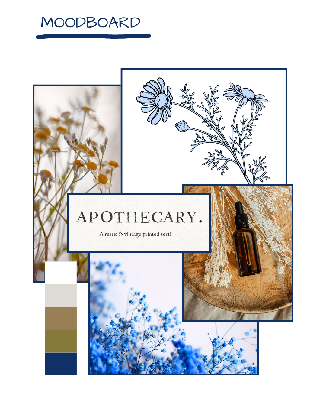
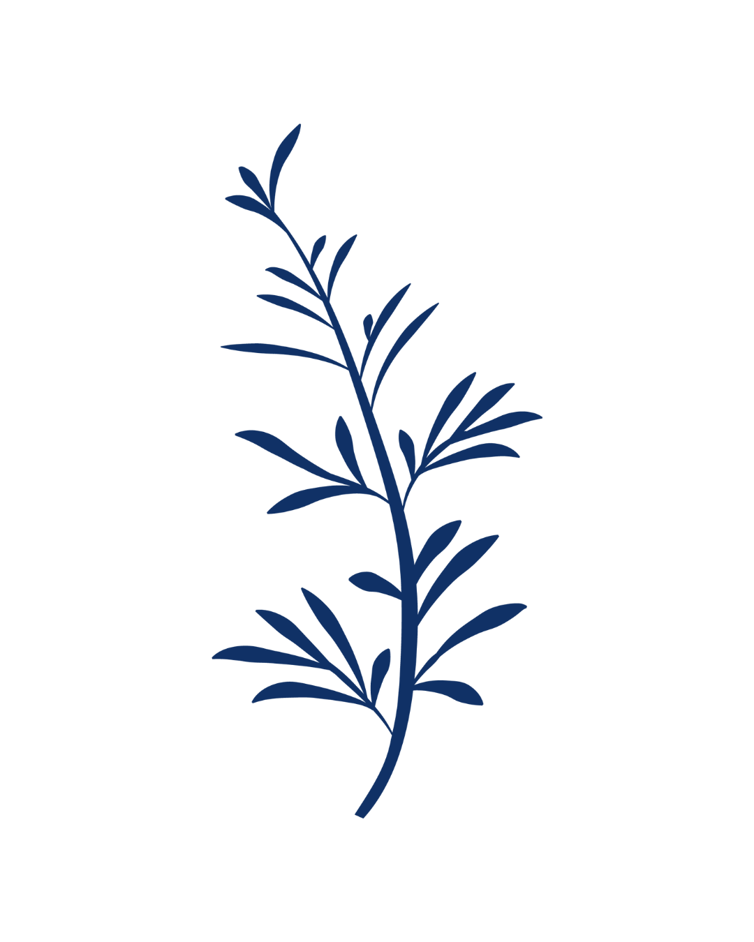
The Aesthetic of the Gesture
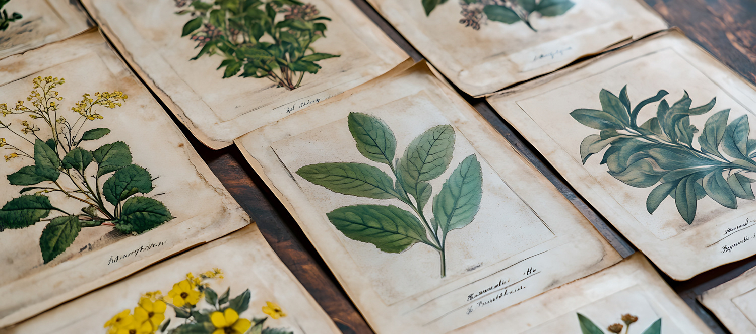
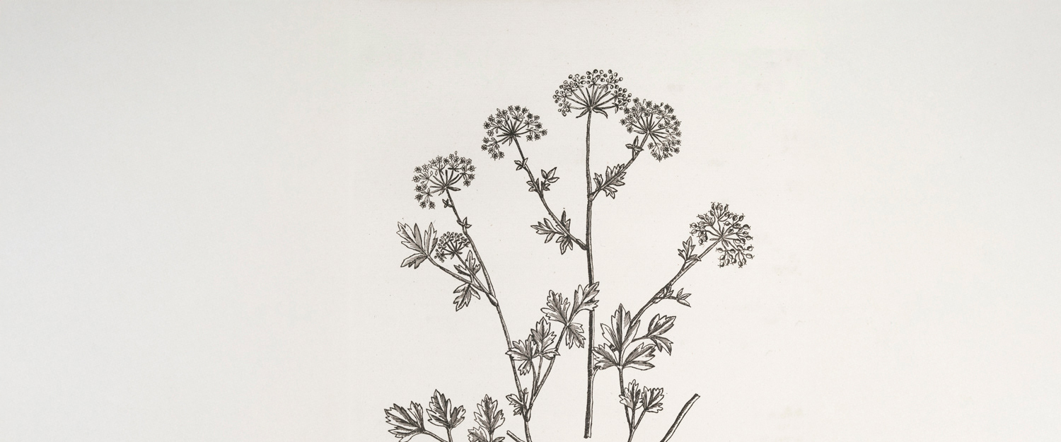
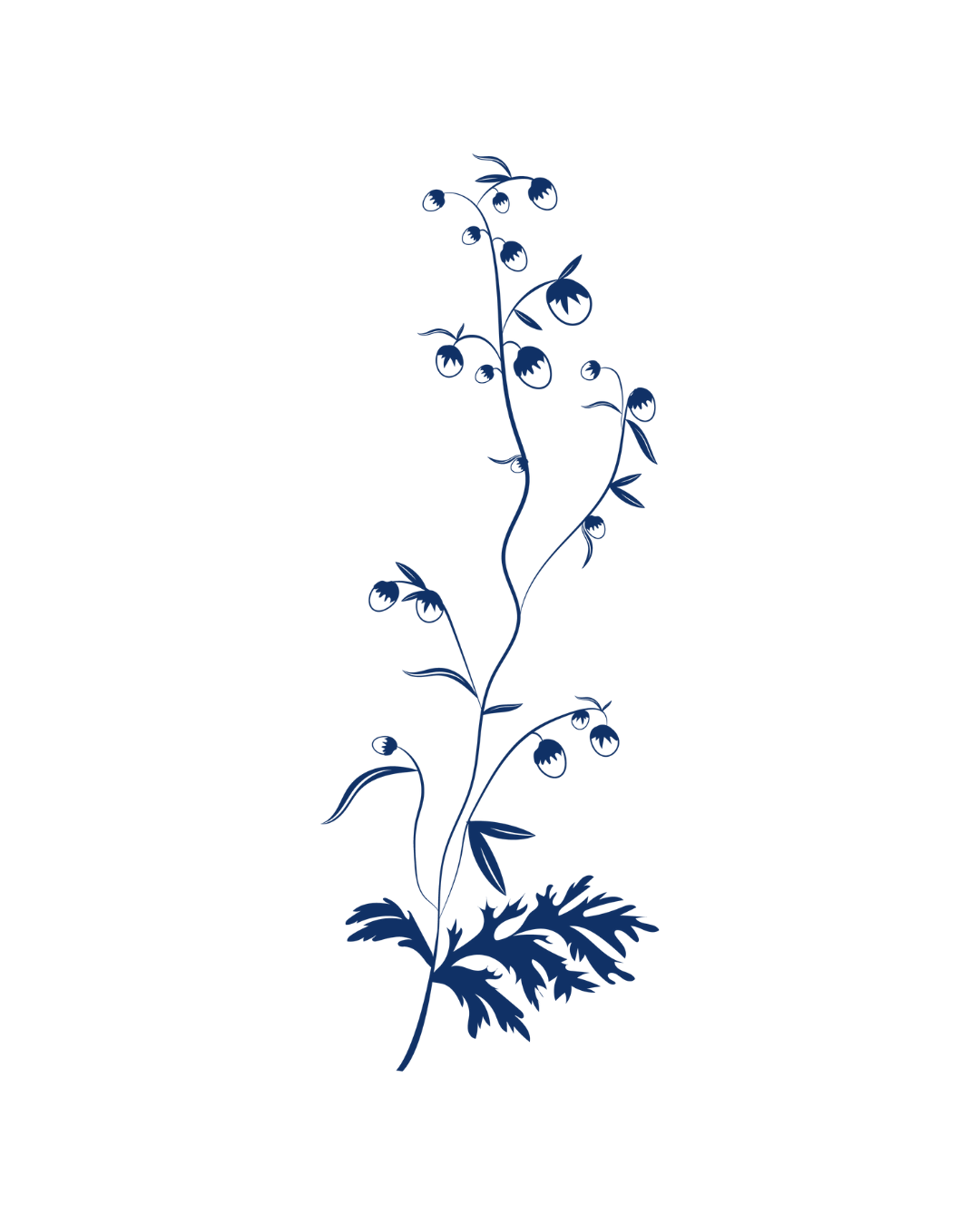
I worked on a delicately wild visual universe: feminine but unforced, contemporary yet rooted. I drew inspiration from sixteenth‑century herbariums, from that handwritten logic of observation, classification, and collection. I approached the art direction process as something similar: selecting, distilling, and assembling.
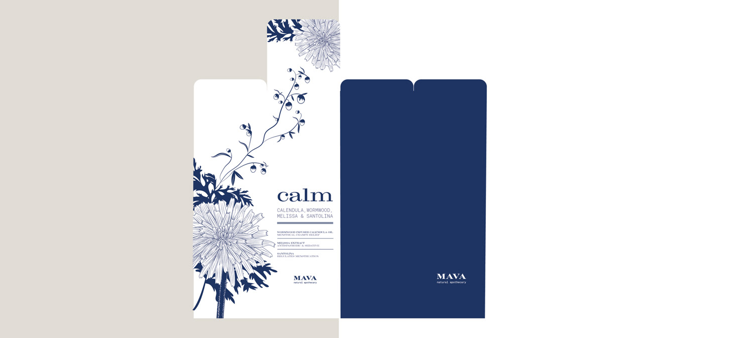
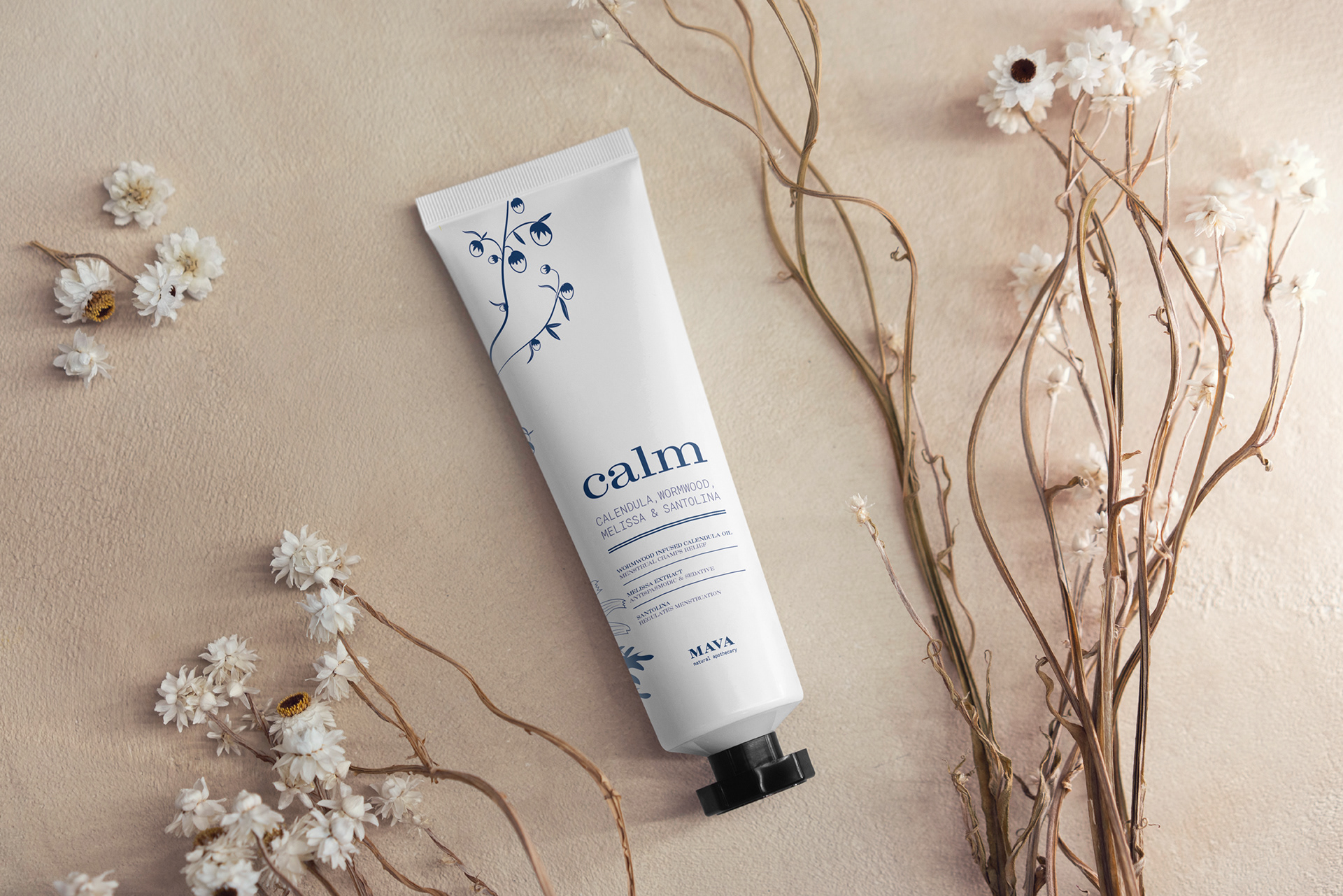
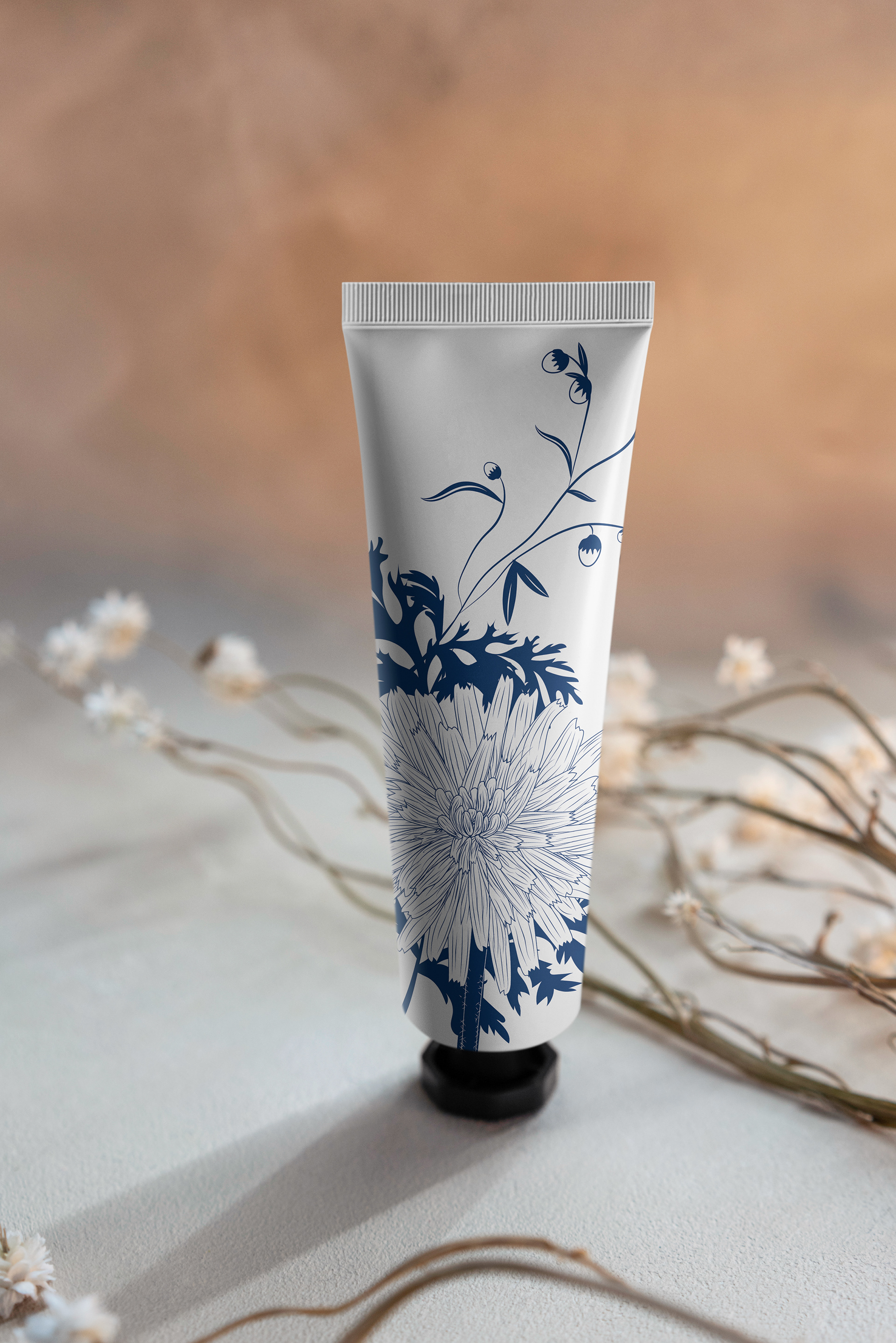
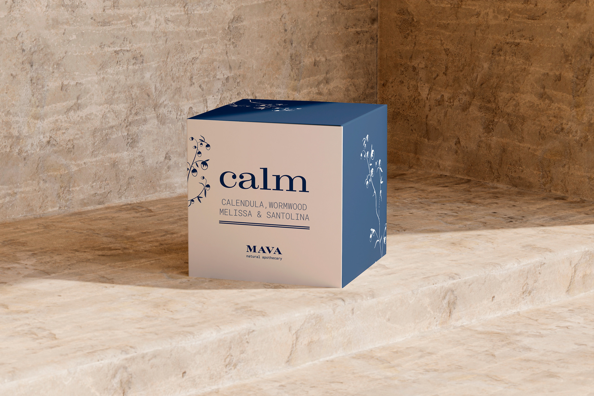
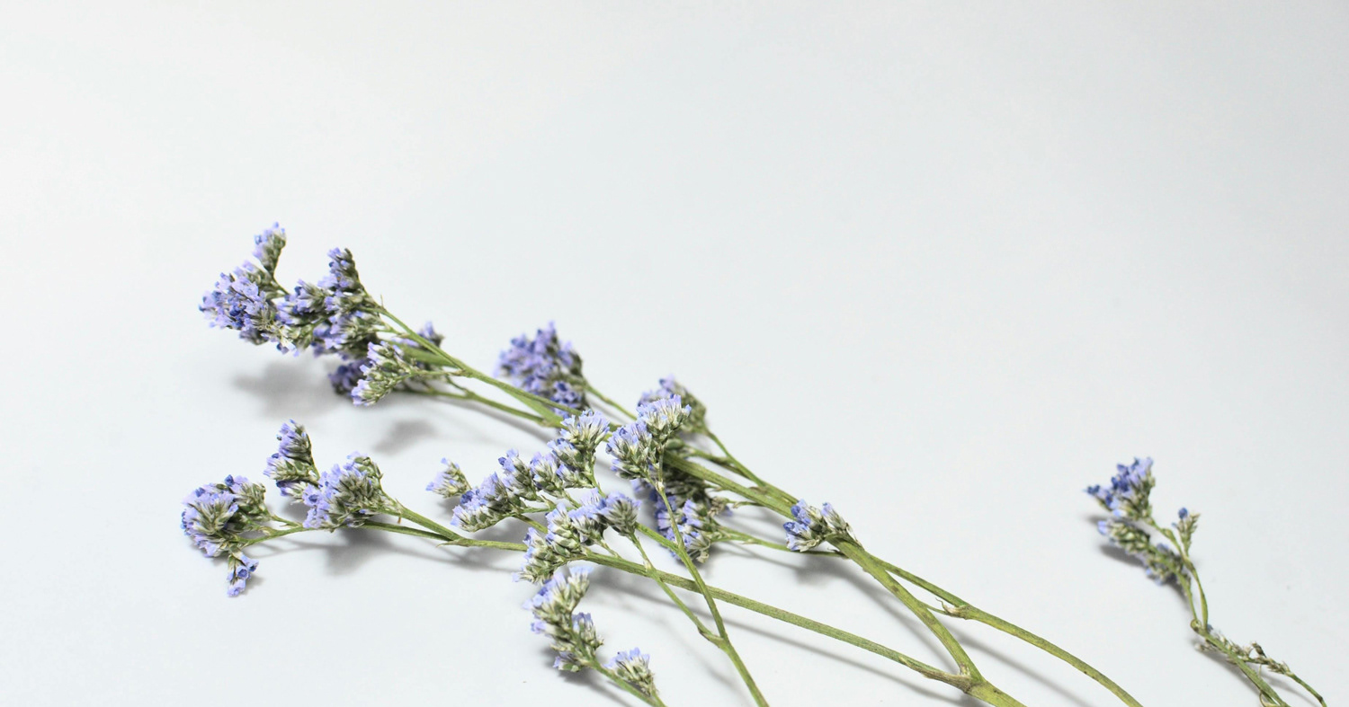
I sought to convey calm, care, and sophistication through airy compositions and a palette where colors evoke mastery, depth, creaminess; elements like seawater, stone, dew, clay, twigs and dried flowers, fresh leaves, and moss. Typefaces with character—but without loudness—accompany that sensory universe.
Every decision was guided by the sensations evoked by her products: freshness, gentle warmth, rest, lightness. As if opening a jar or applying a cream meant entering a suspended, intimate moment, where beauty is simple and profoundly alive.
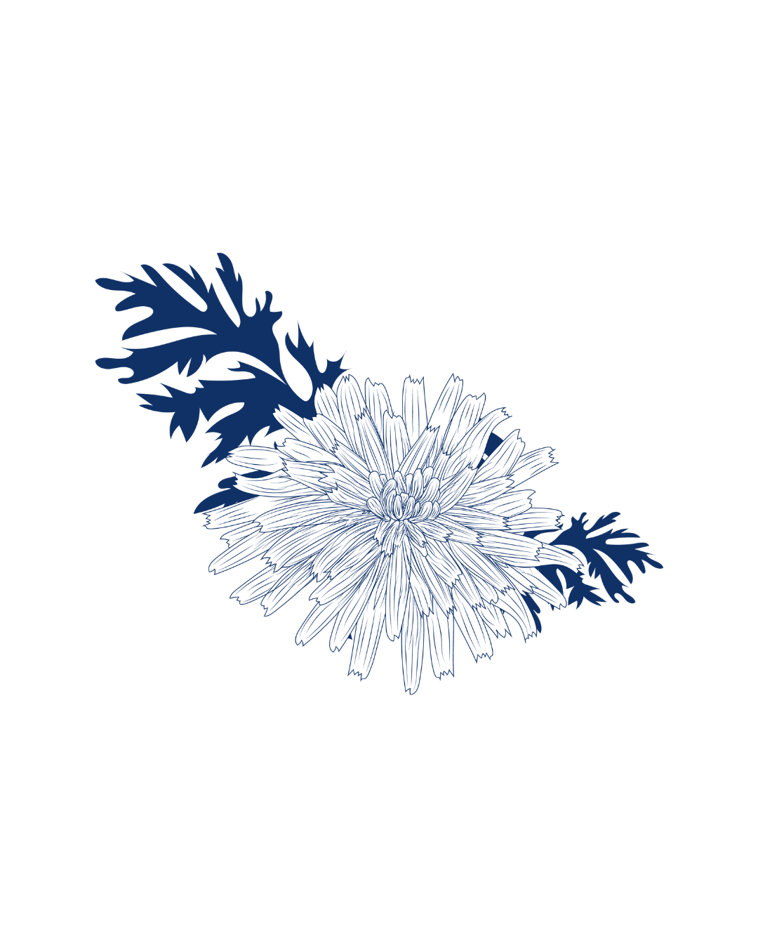
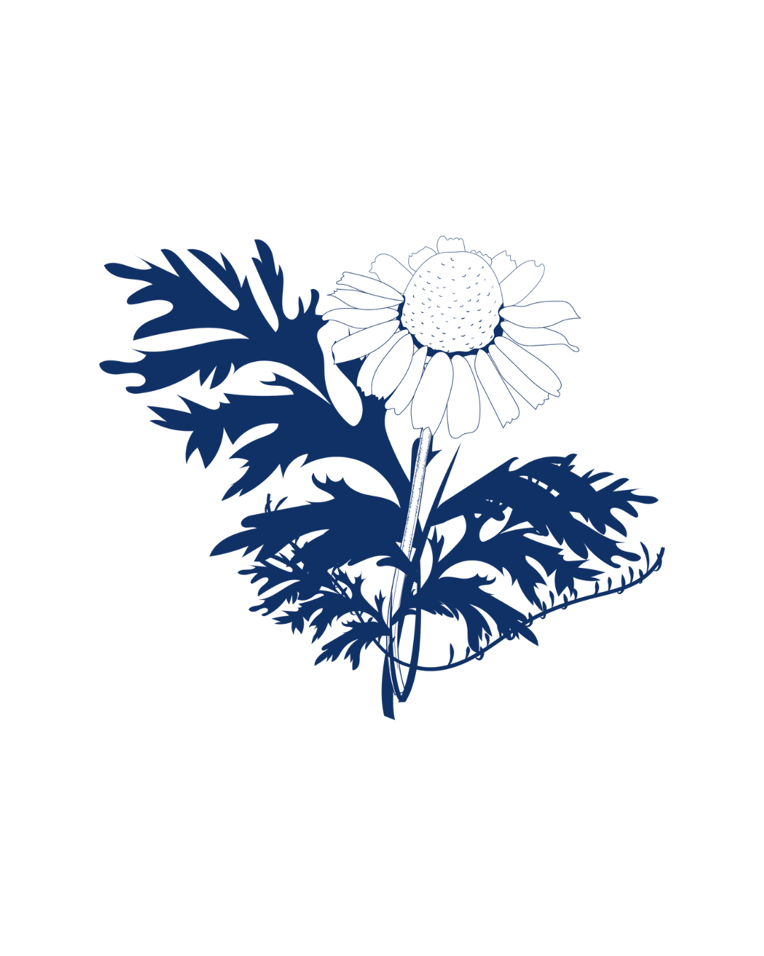
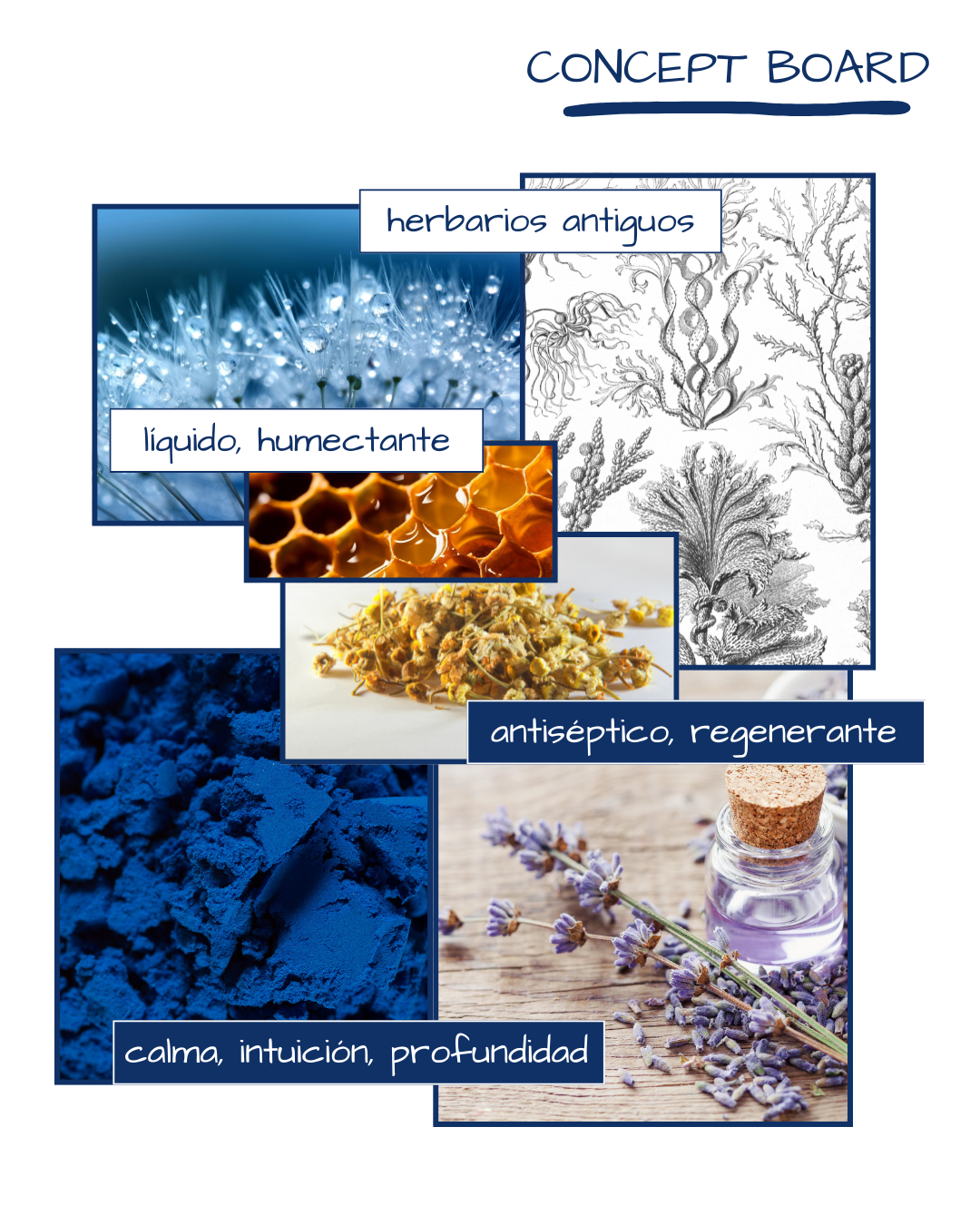
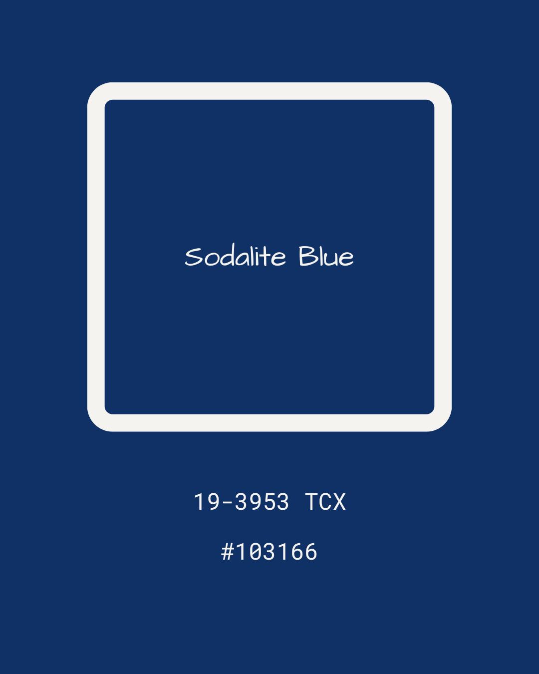
On the Use of the Blue Color
When one thinks of “ancestral medicine,” “earth‑based,” “wild and healing,” the mind goes straight to browns, ochres, and dry greens. And while those tones are logical, the idea was to step away from that already established palette.
The chosen blue—a deep blue—appears as an intentional anomaly, because it represents intuition, ancient wisdom, contemplation, depth, sovereignty. It has something calm and contained, like the voice of someone who has lived a lot and no longer needs to shout.
This particular color is tied to the pictorial: to those rare pigments used by Renaissance painters, expensive because they were extracted from semi‑precious stones like lapis lazuli. That kind of blue—special, reserved—connects with what is precious and carefully crafted, and at the same time with the immensity of the ocean, with the sky before a storm, with what rests.